The Art of the ‘Bento’ Dashboard: Visualising Your Financial Health
Most financial tools for freelancers are either overly complex spreadsheets or boring, static tables. At RateRun.Net, we wanted something different—an interface that doesn’t just store data, but tells a story.
Inspired by the “Bento box” design philosophy, our dashboard is a high-performance grid of modular panels, each designed to give you instant clarity on a specific part of your business.
The Retention Mechanic: “Today vs Target”
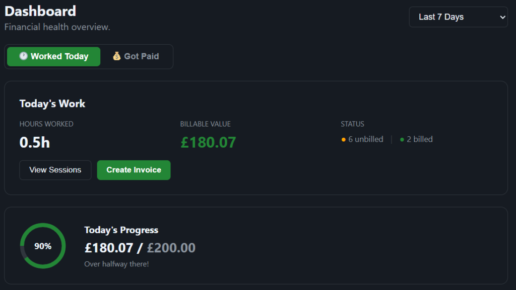
The heartbeat of the RateRun dashboard is the Daily Progress Widget. We’ve implemented a visual “health ring” that tracks your real-time earnings against a daily goal you set in your settings.
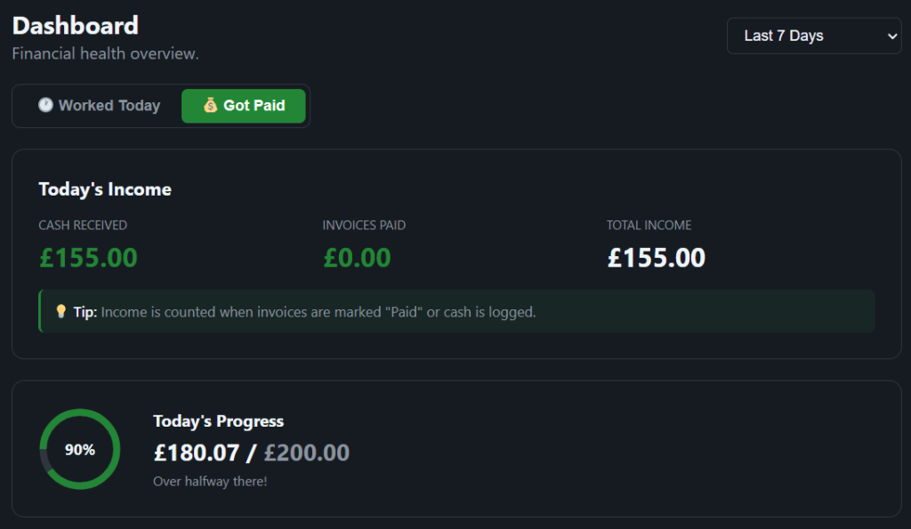
By seeing that ring fill up throughout the day, tracking your time becomes more than just an admin task—it becomes a game. Are you “Over halfway there!” or have you already “Goal reached! 🚀”?
Beyond the Ring: Deep Visualisation
The Bento layout allows us to pack a massive amount of intelligence into a single view without it feeling cluttered:
- Activity Trends: A weekly bar chart that shows your “hustle” over the last 7 days.
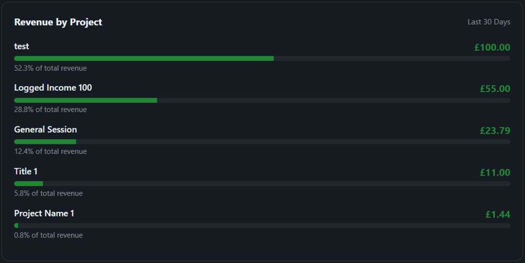
- Project Breakdown: A dynamic list showing which projects are your real “cash cows” versus which ones are taking up too much time.
- The Toggle System: Switch between “Worked Today” (time focused) and “Got Paid” (cash focused) with a single click to change your perspective from worker to owner.

Why Bento?
The Bento design works because it respects your focus. Each panel is a self-contained unit of information. Whether you’re checking your net profit after expenses or looking at your recent activity list, you get exactly what you need without the noise.
Launch your Dashboard and see your business in high definition.
